Textalk's visual identity
At Textalk, simplicity and minimalism are at the heart of our philosophy. The design is like air - invisible but essential - and emphasizes the most important thing: the information. With precision and clarity, we create experiences that focus on content and accessibility.
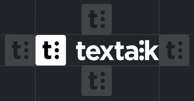
Textalk logo - a symbol of accessibility and communication
Our logo represents our mission and our history. The three dots in the symbol are Braille for the letter 'l', linking back to our beginnings as a pioneer in digital solutions for the visually impaired - focusing on making newspapers accessible in speech. The name Textalk reflects our original purpose: to make text speak.
Today, decades later, 'making text talk' is still a pillar of our business, but in a broader sense. It's about making content and technology accessible to everyone, everywhere. Our work ranges from e-commerce solutions to digital and talking newspapers. The logo stands as a reminder of our commitment to accessibility, innovation and communication.
Logos
We always use SVG for its scalability and quality where it's supported, but for exceptions such as emails, where many clients don't support it, we choose PNG to ensure proper display.
Light Mode

Dark Mode

Abicart Light

Abicart Dark

Prenly Light

Prenly Dark

Webarch Light

Webarch Dark

Vision Light

Vision Dark

The importance of air
Air is a crucial part of Textalk's visual identity. It allows our logo to breathe, emphasizes its simplicity and ensures a clear and professional appearance. To maintain this balance, the Textalk logo must never be placed closer to another element than the size of the symbol (the T) in the logo. This "air zone" creates a harmonious experience and ensures that the logo always appears clear and accessible, whatever the context.

The T
"The T is used when it is not practical or appropriate to use the full Textalk logo, for example in smaller spaces or where a simple symbol or icon is needed. "The T" maintains recognition and brand identity, while providing flexibility in design. "The T" is used as a favicon and app icon.
"The T" should never be made too large; it is intended to be used as an icon or symbol and should replace the full logo only when it is more practical or appropriate.
Textalk "The T" Dark

Textalk "The T" Light

Abicart Icon

Prenly Icon

Webarch Icon

Vision Icon

Colors
Textalk's basic colors, black #000000 and white #ffffff, as well as neutral grays, reflect simplicity and clarity. We add high-contrast colors for accessibility, support both dark and light modes, and follow standards for all devices. Our products are enhanced by their colors: orange #e87502 for Abicart, blue #1266f1 for Prenly, green #288140 for Webarch and red #d62516 for Vision - always in harmony with the Textalk brand.
Typography and texts
We use Inter by Rasmus Andersson, a modern and accessible font that reflects clear communication. Inter is used on the web and where customized fonts are needed, while standard fonts are used on other platforms for optimal compatibility.
For good readability, we always use at least 1.5 line spacing and keep line lengths to a maximum of 60-75 characters, about 10-12 words. Avoid centered or right-aligned text, as text with a straight left margin is much easier to read.
In digital media, aligned text should be avoided, as uneven spacing impairs reading flow and accessibility, especially for people with reading difficulties - left-aligned text is therefore preferable.
To facilitate readability, especially in digital media, texts should be divided into paragraphs according to the 'one thought, one paragraph' principle - this makes the content more clear and accessible.
Headings and paragraphing should always be used semantically correctly in HTML. Elements such as h1-h6 and p should be used according to their purpose to ensure structure and accessibility.
Images
In our images, we always aim to show real people in real situations. When we talk about our technical solutions, the focus is not on the technology itself, but on the people using it and what they have been able to achieve with our help. The images should reflect the reality of our users' lives and illustrate how our solutions help simplify, improve and inspire. This way of using images strengthens our story and makes it more relevant and accessible.
Email templates (internal)
https://design.textalk.se/textalk/mail/
In our email templates, we make a conscious departure from our Inter font and use Arial, sans-serif instead. This choice ensures optimal compatibility and a consistent visual experience across all email clients.