 Dansk
Dansk
 Deutsch
 Español
 Français
 Italiano
 Norsk
Norsk
 Polski
 Português
 Suomi
Suomi
 Svenska
Preview themes in mobile view
Art. no. 216070209

Here we go through how to preview themes in mobile view for different browsers.
Most browsers have tools that resize the window to mimic the look of a mobile or tablet. Since many end customers make purchases on mobile and tablet, it can be interesting to preview a new theme you've created, for example, so that you also know how the look of the store will look to those customers.
Previewing with Firefox, Google Chrome and Edge
When previewing an active or inactive theme under Appearance>Themes, do the following to open the inspection tool in the browser:
- Firefox: Ctrl + shift + M
- Google Chrome: F12 and then Ctrl + shift + M
- Edge: F12 and then Ctrl + shift + M
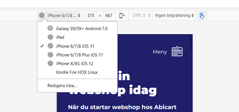
Now the inspection tool is running, you can then choose to widen the height or width of the view itself , or choose one of the preset sizes to mimic how it would look for a number of different devices.

Previewing with Safari
When previewing an active or inactive theme under Appearance>Themes, do the following to open the inspection tool in your browser:
1. Safari menu> Preferences> Advanced
2. Tick the box for "Show develop menu in menu bar"
3. "Develop" is now an option in the menu bar in Safari. Click on Develop-> "Responsive design mode"
Now the inspection tool is running, you can then choose to widen the height or width of the view itself, or choose one of the pre-set sizes to mimic how it would look for a number of different devices.
To preview with Safari you need to go through a few more steps, so we recommend using a Firefox, Chrome or Edge in the first instance for mobile view previews.
 with Abicart