 Dansk
Dansk
 Deutsch
 Español
 Français
 Italiano
 Norsk
Norsk
 Polski
 Português
 Suomi
Suomi
 Svenska
Create a home page for your application
Art. no. 216093531

Create a start page for your application
The home page is the page that the reader sees first in the application.
It shows a logo, a component with the latest publication and other components with a couple of older publications and a link to the archive.
If you have chosen that your publication requires a login, there is also a login link in the top right corner.
In addition, you can add special components such as banners, flashbacks, podcasts, text, etc.
To be able to manage the start page, you need to have the role Application Manager or higher.
Below we go through how to create a start page and how the different components work.
1. Log in
Log in via https://content.textalk.se with the user information you received from Textalk support.
If you have forgotten your password, you can reset it via the Forgot Password service.
If you have forgotten your username, contact support via hello@prenly.com.
2. Select applications
In the menu you should now see the option Applications (if you have the right authorization). Select the application you want to build/manage a start page for.
Under the Home tab, build your page with optional components.
A tip is to first look under Application settings so that your title is entered in the application. Read more here.
3. add a carousel
We start by adding a Carousel to display the latest publication.
- Name the carousel so you can keep track of what it contains later (e.g. "Latest publication".)
- Choose between four different sizes to display. Try out what works best for your title. In this case we choose an Extra large.
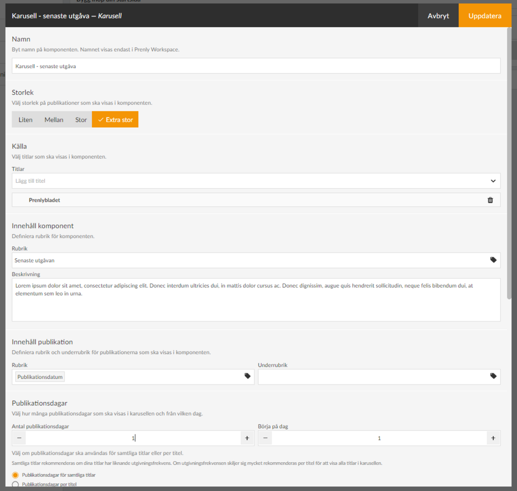
- Under Source, select the titles to be included in the component.
- Under Content component, put a Heading that your readers will see (e.g."Latest edition"). You can also write a descriptive text if you want.
- Under Publication content, define how your title will be presented in the carousel and the publication date.
For the title, click on the tag icon and select, for example, Publication date. It is also possible to have a subheading that could, for example, be the name of the title if you have several different titles displayed in the same carousel.
- Under Publication days , first select the number of days of the title to be displayed in the carousel. Keep in mind that the number of titles displayed in full depends on the size you selected (see above) and the unit in which the start page is displayed. In our case, we set 1 publication day to show only the latest publication.
- Under Start on day, you can choose to skip, for example, the latest publication and start on day 2, which will be useful in our next carousel. We leave this on 1 in this case.
If you have several titles displayed in the carousel, there is also a setting to show the number of publication days per title.
We recommend that you select the Publication days option for all titles if your titles have a similar publication frequency. If the publication frequency differs a lot, it is recommended per title to show all titles in the carousel.
- Under Text on archive link you can change the text Archive which is set as default. For example, if you want to write "See the whole archive" instead.
- Under Download you can set whether the publications in the component should be able to be downloaded offline from the start page, then a download icon will appear.
- The Appearance section allows you to change background colors, text colors, etc. in the component. We will leave them as default for now.
- The last selection is Time limit. Here you can control whether the component is displayed for a specific period of time. You can choose either start time, end time or both.
If a component has no required content, such as Title, the checkbox will be grayed out and cannot be activated until it is filled in, to prevent empty components from appearing on your home page.
Use the drag-and-drop menu to place the components in the order you want them to appear on your home page.
4. Save component
When you are done with the configuration, select Update in the top right corner. The component is now prepared for publication but is not yet visible to the reader.
The checkboxes allow you to activate or deactivate components. Only active components will be visible.
5. Create another carousel to show more issues
We add a new carousel to show the last 2-15 issues. Follow the steps above for more detailed instructions:
- Select size Medium.
- Add the title.
- Set the title to e.g. "Read our older publications".
- Set the number of publication days to 15 and start on day 2 (i.e. skip the latest publication which is already above).
- Update.
6. other settings
We are now going to configure the logo and colors on the start page. Select the Background and top row section. Here you can set the colors of the home page header, text color, and if you want a different background color on the home page. We also upload a logo by clicking on Browse and selecting a suitable image.
Here we can also choose to hide the top bar for the mobile version of the app (Android and iOS) but we leave it visible in this case.
7. Publish our home page.
Now we have a basic configuration of the home page ready and we are ready to publish it.
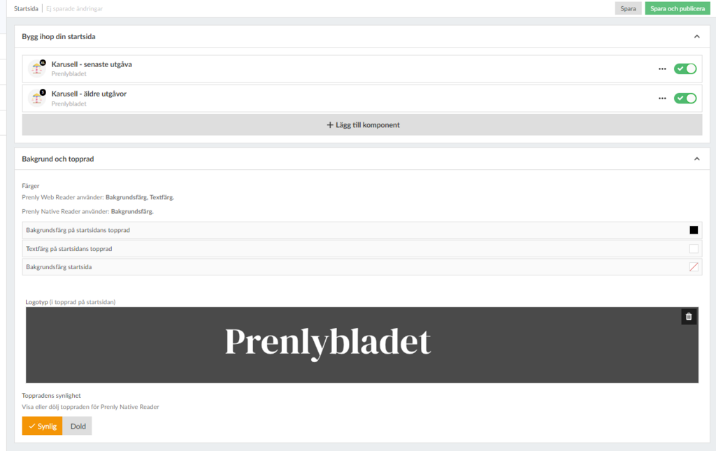
After each component there is a checkbox to activate the component. We drag it to the right so that it turns green and then click the Save and Publish button in the top right corner to finalize the setup.
Congratulations, now you have created a home page!
 with Abicart